Congratulations! You’ve decided to take your business right into the 21st century by creating a website, to increase the number of clients who can find you. Smooth sailing, right?
Not yet. There are some important factors to consider when it comes to developing a website; a well-organised navigation bar being one such factor.
Having the right design is critical – the menu bar affects traffic, conversions and user-friendliness. It is connected to everything important on your website and must be paid special attention.
We have compiled a list of 7 Top Tips to help you design the perfect website menu bar!
1. Use standard menu types
Since menu bars are most often placed horizontally at the top of a website or vertically on the left, it is important to be consistent and place them where visitors expect to see it. Menu bars placed in the middle of a webpage are non-standard and can be difficult for users to locate.
Another popular type of menu bar is the sticky menu. A sticky menu follows the user down the page as they scroll and it usually always stays at the very top of the screen. This is great because even if the user scrolls right to the bottom, they still have full access to the main menu, where they can navigate to different parts of your website.
A standard, organised and uncluttered menu improves the overall aesthetic of a website’s design. Menu links that are short and to the point also improves usability.
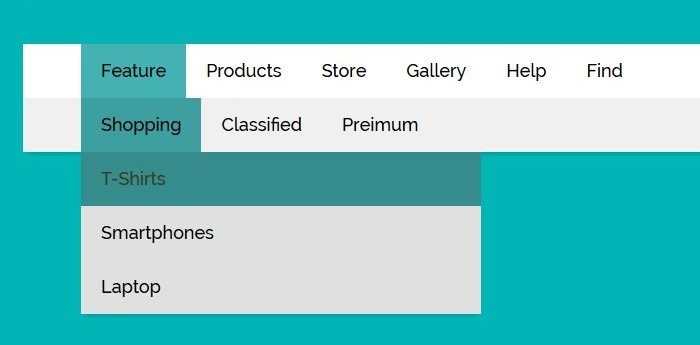
2. Categorise properly
These days, with all of the great technology that exists today, people like everything to be fast. Including your website. Menu bars with concise and clear categories allow people to quickly and easily access information about your company.
Make sure that you organise your posts and products logically. The main categories should ideally have subcategories that take users to specific pages containing the services, products or posts that they’re specifically looking for. This type of organisation provides plenty of wiggle room for adding more categories later on without messing up your menu.
Every single page of the website should be found from this menu – so don’t leave pages out if you are struggling to place them in a category; revise until it is organised correctly.
Last but not the least, make sure that the terms you use make sense to the kind of user you’re looking to attract. Don’t use industry-specific jargon if you are looking to appeal to the general population or an audience that may not be as well-versed in the subject matter. Just like you need to adjust all of your website to appeal to the kinds of visitors you are looking to convert, you also need to adjust the language of the menu.
3. Use Call-To-Action buttons to increase conversion rates
Add your own Call-To-Action button, like “Call Us” or “Book Now”, to your navigation bar so it’s easy to guide your visitors to where you want them to go.
Think of your CTA button like a “shortcut” to the destination of your choice. You could use it to direct more visitors to your About page, get them to make a booking, buy a product, or let them call or email you with just one tap. Efficient and simple, right?
4. Consider device optimisation
Nowadays it is vital for your website to be optimised for mobiles, and for other platforms as well. You will attract traffic from all kinds of devices, all of which will display your website in different sizes, layouts, and resolutions.
Your menu needs to work incredibly well across all of them. If it doesn’t, you risk losing a significant portion of your audience.
Some menus will be easier to optimise across different screen sizes than others, and you may end up sacrificing some of the elements or some of the animations. But if that’s what it takes to make the menu work, then do it. Make sure you also consider both portrait and landscape modes across all of the possible screen resolutions and sizes.
5. Don’t hide the menu bar
When it comes to website navigation design, you should always display the things that are most important to visitors most prominently. This rule works both for the content and navigation options. In order to save space, some designers use icons like the ‘hamburger menu’ that hides navigation by default and makes it available on demand. It’s better to avoid using the hamburger menu on desktop because some visitors won’t click/tap on the hamburger icon to see the options. Remember the old saying, out of sight, out of mind? It still works today and applies to your website’s user experience.
6. Provide a search option
A search option can act as a shortcut – visitors can rely on this to find what they are looking for quickly, without the need to navigate through categories. But at the same time, search should not be used as a replacement for a menu (unless you are Google!) Visitors who use search clearly know what they’re looking for. Therefore, it’s less about exploration and more about finding a particular piece of content faster.
7. Maintain a clear, concise design
The navigation menu should be clearly labelled and signposted so that users understand where they are and where they can go.
By using appropriate and familiar copy for your navigation elements throughout your product’s design, your users will feel comfortable navigating your website. If consistency is maintained and clarity promoted, it will make navigating your website a breeze.
A navigation bar will usually link to designated pages which have the right text that makes sense for that section.
Imagine you’re designing the menu for a clothing store and you want users to be able to access a page dedicated to blouses. Labelling that category as “Blouses” in the menu makes it clear to the user what they can expect from clicking on that link.
Remember, when it comes to navigation, it’s always best to maintain clarity.
Summary
If you’re looking to improve the flow of your website and help people find what they’re looking for more easily, some simple tweaks to your main menu can work wonders.